When someone lands on your website for the first time, a decision happens faster than most business owners realize. Visitors begin forming opinions about your brand almost instantly, often before they read a full sentence or scroll through the page. This moment is commonly referred to as the Blink Test, a simple concept that asks whether someone can understand your business within the first few seconds of visiting your site.
Research shows that users form impressions about a website in just milliseconds, meaning your design, messaging, and structure all begin communicating immediately. In that tiny window, visitors are subconsciously evaluating whether your business appears professional, trustworthy, and relevant to their needs. If those signals are unclear or confusing, many users will leave without exploring further.
For small businesses in particular, these early impressions carry significant weight. Your website may be the first interaction someone has with your brand, and that experience shapes how they perceive your credibility and expertise. Thoughtful website design for a small business focuses on creating immediate clarity so visitors understand what you do and how you can help them.
The 3 Website Questions Visitors Ask Immediately
When visitors arrive on a website, they instinctively begin scanning the page for answers that help them orient themselves. Rather than reading every word, most users quickly evaluate headlines, visual cues, and layout structure to determine whether they are in the right place. In those first few seconds, they are essentially asking three critical questions that guide their decision to stay or leave.
1. What Does This Business Do?
The first and most important question visitors ask is whether they clearly understand what your business offers. Your homepage headline and opening section should immediately communicate the service you provide and the type of customers you serve. Unfortunately, many small business websites rely on vague or overly creative phrases that sound polished but fail to deliver clarity.
Statements such as “Innovative Solutions for Modern Businesses” or “Helping You Reach Your Full Potential” may sound impressive, but they rarely explain what the business actually does. Visitors should never have to interpret your value proposition or guess how your services apply to them. Clear messaging that directly explains your offering almost always performs better than language that prioritizes style over substance.
2. Can I Trust This Company?
Once visitors understand what your business does, their next evaluation focuses on credibility. Trust plays a central role in how people choose service providers, especially online, where they cannot interact with your team face to face. Within seconds of landing on your site, users begin looking for signals that reassure them your business is legitimate and experienced.
These signals often include elements such as client testimonials, professional imagery, recognizable partnerships, and clearly displayed contact information. Even the quality of your design contributes to how trustworthy your business appears. A site that loads slowly, feels outdated, or looks poorly organized can cause visitors to question the professionalism of the company behind it.
Many consumers are unlikely to return to a website after a poor online experience, meaning design quality directly influences long-term engagement.
3. What Should I Do Next?
Once visitors understand your services and feel confident in your credibility, they naturally look for guidance on the next step. A well-structured website should make this process effortless by clearly directing visitors toward meaningful actions. Without this guidance, even interested users may leave simply because the path forward is unclear.
Strong calls to action help visitors move smoothly through the decision-making process. These actions might include scheduling a consultation, requesting a quote, calling your office, or contacting your team through a form. Strategic website design for small businesses ensures these opportunities appear naturally throughout the page so visitors always know how to engage when they are ready.

The Most Common Blink Test Failures
Many small business websites struggle to pass the Blink Test, but the problem is rarely a lack of effort. In most cases, the issue stems from structural or messaging decisions that unintentionally create confusion for visitors. Understanding these common pitfalls can help businesses recognize why their websites may not be performing as expected. These are the most common issues our BoBella team has found in many websites.
Above the fold
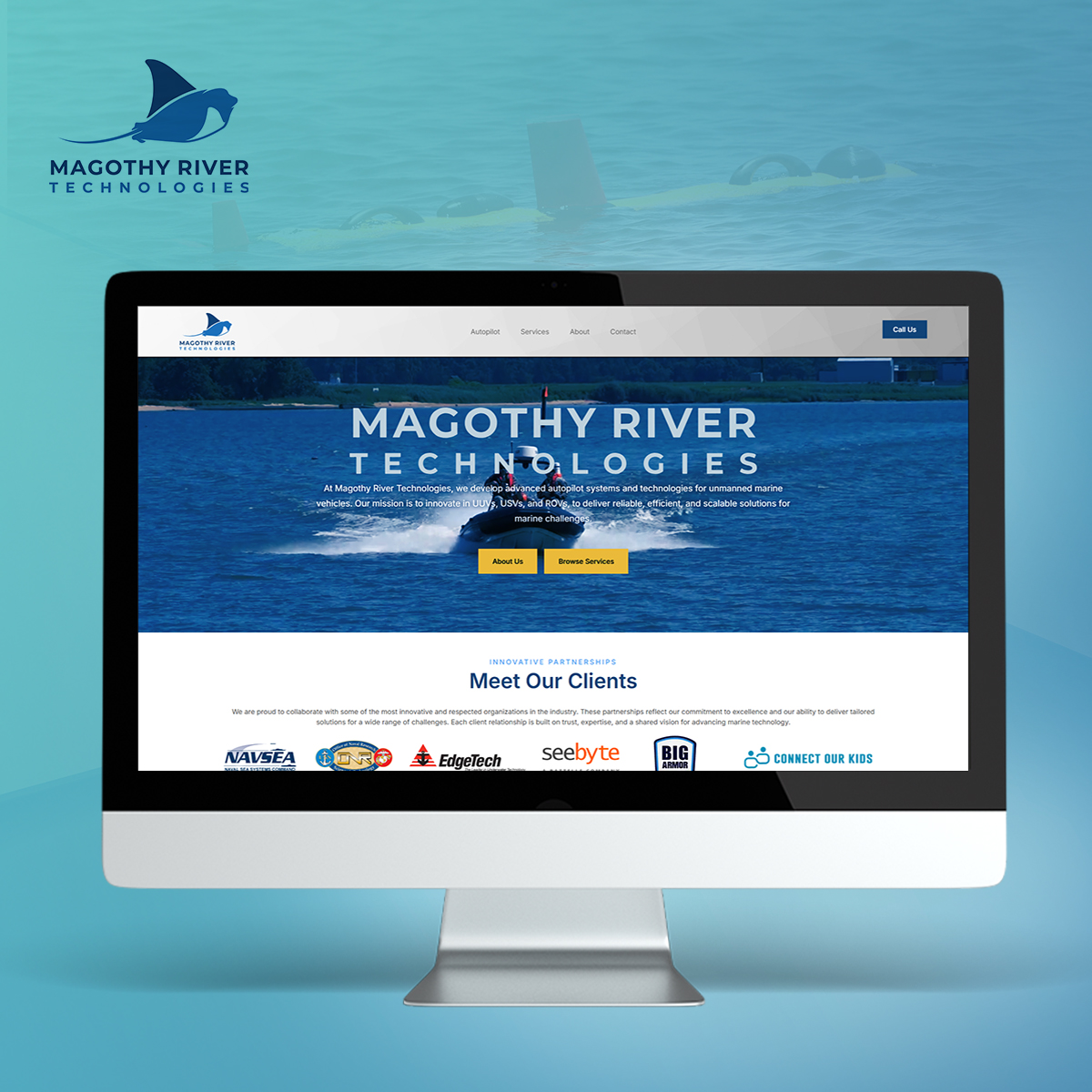
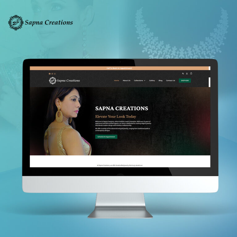
The hero section is the first area visitors see when they land on your homepage. It includes everything visible “above the fold,” meaning the content that appears on the screen before a user scrolls. This space is critical because it forms the first impression of your website and often determines whether visitors stay or leave.
A strong hero section should clearly communicate what your business does, who you help, and what action visitors should take next. A clear headline, short supporting message, visual element, and call-to-action button help visitors quickly understand your value.
Vague Headlines
A headline serves as the first piece of communication visitors encounter. If that headline fails to explain your services clearly, visitors may struggle to understand your value within the critical first seconds. This confusion often leads users to leave before exploring deeper sections of the site.
Clarity consistently performs better than cleverness when it comes to website messaging. A straightforward explanation of what your business offers is far more effective than a phrase that requires interpretation.
Cluttered Layouts
Another frequent issue is visual clutter, which occurs when a website attempts to communicate too many ideas at once. Users should be able to find what they are looking for in as few clicks as possible. Pages filled with large blocks of text, multiple promotional banners, competing images, and inconsistent formatting can overwhelm visitors quickly. Instead of guiding the user through information logically, the layout creates friction that interrupts the browsing experience.
Effective design relies on visual hierarchy, which organizes content so the most important elements naturally attract attention first. Clear navigation menus should be a priority. Strategic spacing, clear headings, and balanced layouts help users process information comfortably. When these design principles are missing, visitors may feel overwhelmed and leave before fully understanding what the business offers.
Weak Calls to Action
Even well-designed websites can struggle if they fail to guide visitors toward action. Many small business sites provide helpful information but never clearly invite users to take the next step. Without that direction, potential customers may browse briefly and leave without converting.
Strong calls to action appear consistently throughout the page rather than being placed in a single location. These prompts help visitors move forward when they feel ready, creating a smoother transition from interest to engagement. Repetition also reinforces the action you want visitors to take, increasing the likelihood that they will follow through.
Missing Credibility Signals
Credibility markers play a powerful role in building trust, yet they are often overlooked by small business websites. Visitors want reassurance that others have worked with your business successfully before deciding to reach out. Without visible proof of experience, even interested prospects may hesitate to make contact.
Testimonials, client reviews, industry certifications, and examples of past work all help strengthen credibility. They act as social proof, demonstrating that your business delivers real results. When integrated thoughtfully into your design, they help reinforce confidence and reduce hesitation during the decision-making process.

The Structure High-Performing Websites Use
High-performing websites often appear simple at first glance, but their structure is carefully designed to guide visitors through information efficiently. Rather than overwhelming users with excessive content, successful sites focus on clarity and organization. This strategic structure helps visitors quickly understand the value of the business and determine whether the services meet their needs.
- Clear Headline Hierarchy: One of the most effective structural approaches involves layering information so visitors can absorb it quickly.
- Navigation Menu: A well-structured navigation menu helps visitors find what they are looking for and move through the website quickly and confidently.
- Strategic Call-to-Action Placement: Calls to action are most effective when they appear in predictable locations throughout the page.
- Conversion-Focused Layout: A well-structured layout helps guide visitors naturally from one section to the next without overwhelming them.
- Trust Elements: High-performing websites consistently reinforce credibility through visual and informational cues.

How Businesses Can Fix a Failing Website
If a website struggles to pass the Blink Test, the solution is not always a complete redesign. In many cases, meaningful improvements can be achieved by refining messaging, strengthening structure, and enhancing credibility signals. These adjustments help transform a confusing experience into one that clearly communicates value.
Simplifying messaging often means removing unnecessary jargon and focusing on direct explanations. When language becomes easier to understand, the overall experience becomes more approachable.
Applying strategic use of headings, spacing, and layout can dramatically improve how people process content on a page. When information flows naturally from one section to the next, users are more likely to stay engaged.
It’s important to remember that modern websites should reflect how people naturally browse and interact with digital content. Mobile responsiveness, fast loading speeds, and intuitive navigation all contribute to a smoother experience. When a site aligns with user behavior, visitors can focus on the content instead of struggling with the interface.
Choose a Solution That Brings The Highest Success
A website is often the first introduction someone has to your business, which makes those first few seconds incredibly important. If visitors cannot quickly understand what you offer, why it matters, and how to take the next step, they are likely to leave before discovering the value you provide.
Strong website design for small businesses focus on clarity, structure, and trust. When these elements work together effectively, a website becomes far more than a digital brochure. It becomes a powerful tool that supports lead generation, strengthens credibility, and guides visitors toward meaningful engagement.
At BoBella Brands, we design websites that communicate clearly, reflect your brand professionally, and help convert visitors into customers. Our approach combines thoughtful messaging, strategic layout, and strong visual identity so your website actively supports your business goals.
Book a Call or connect with our team to start building a website designed for clarity, credibility, and long-term growth.